Sheryl Oring is a live artist; she performs in public areas to raise awareness on issues having to do with language and the First Amendment. Very political in nature, she uses passing people to relay messages about American politics and the lack of personal voice in the American government. I Wish To Say is an ongoing project in which the artist dresses up as a 1960s secretary (big hair and all) and takes to the street with a manual typewriter and stack of paper. Audiences participate in the production by dictating messages to Oring who then sends these postcards to the President.
The Birthday Project is similar in nature, having audiences attend the traveling birthday party that Oring was throwing for President George W. Bush's 60th birthday. Birthday greetings and insight into what Americans thought of the President's roles thus far in his presidency were mailed out, and the correspondences helped get a better picture of the country's perception of GW.
Oring's performances are important because they draw attention to the fact that the individual American doesn't often have the chance to be a part of policy making and is often overlooked. With current legislation, such as SOPA, avocation for the First Amendment is that much more important so that the citizens of a free country do not lose the right to trade information and opinions freely. Negativity can be the spark that gets a revolution going, but expressing opinions is an important right that history has taught us that we must hold on to.
Tuesday, March 27, 2012
Xerox Project Comments
Cody - Cool idea to make something that is wearable on the body and made of other body parts. The best part was the expression on the face.
Sabrina - I love how you got a xerox of your crossed knees. Must have been hard! I would have liked to see you do something with the body parts in a non-body part way though.
Brian - Like the use of fingers for the branches, using your arms for the hillside works perfectly.
Nakota - It is really cool how you used the locks of your hair and cut each one out to make individual waves. Using the bark as a texture is cool too; I never though of using any other textures besides my body parts, but this adds a great contrast next to your skin.
Arielle - Wish there had been more to see, but I liked that you matched body part names to parts of the racket and used a face on the face of racket.
Michelle - Love how the plastic turned out on the Xerox! Don't think I would have known it would turn out that way if you hadn't used it. The graphic pattern that your image created was great.
Lauren - Using this project as a way to overcome an issue you have with yourself makes it all that more inspiring and interesting to the viewer, and you were the only one that did this.
James - Love the contrast in your images, the different hand forms that you included, and how the appendages went beyond the poster board edges.
Kim - Cool weaved fingers! Not sure why, but I am really into the overall shape of your collage. It is really appealing.
Catherine - My favorite part of your boombox is that you used your name tag for the logo; it makes it that much more personal.
Erin - Love the symmetry in your piece. It also reminded me of a cool finger painting!
Juan - Making a story out of the pieces is an interesting idea. Not sure that I completely understood the story. It would be much better in a sort of animation and if you could make the entire character's body slowly "walk" across the floor.
Chris - I really like the repetition in the waves, and although someone else make a sun from hands, its nice that yours was constructed in a completely different way.
Maria - Good use of scaling, but you were the only one who really incorporated facial scans and refrained from failing back on the use of hands and feet for construction.
Monday, March 26, 2012


Thursday, March 15, 2012
Pixelation in 3D
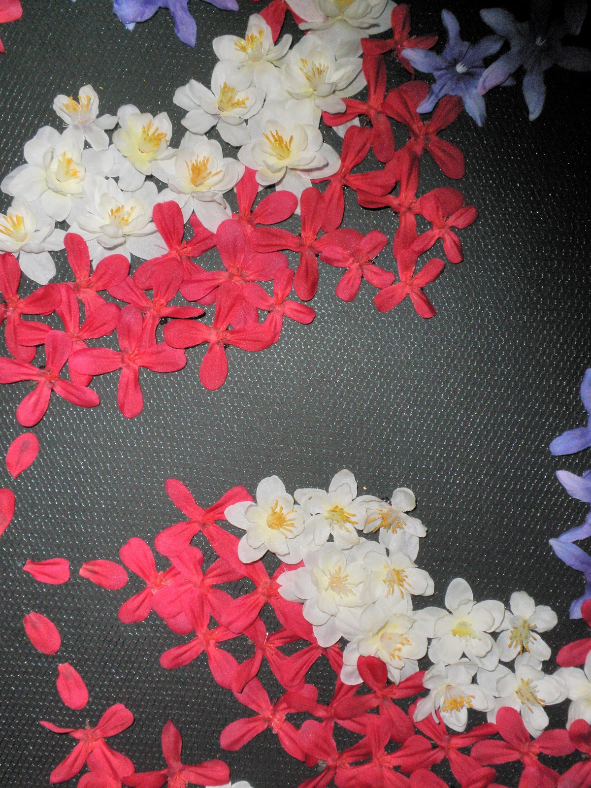
The assignment for 'The Grid Project' was to take a picture and recreate it using a pre-existing grid. All around us we can see grids, in the construction, calendars, and curtain patterns. For my interpretation, I chose to go with the some sort of image in the style of art nouveau, as that has been influencing me recently. Below is the image of a stained glass window of which I chose to convey in my final piece.

You can see that it has a lot of curves and this was completely intentional. The biggest difficulty with pixelating something is figuring out how to make curved lines while conforming to a grid space and using straight objects. My grid space was green mesh netting on top of a black poster board which I then used as the canvas to apply different colored fake flowers as pixels. The netting was small, but the flowers are laid out in such a way that they still follow the rows and columns of a grid. Though a difficult process, trying to lay out pieces on the same plane (not to mention keeping the kitten away from it!), but that were next to each other, I think the end result is a fantastic piece and I will be using is as my own wall decor.


Grid Art Reviews
Lauren - Her beach scene created from beer bottle caps had lots of colors and plenty of variety. The different logos on the caps added texture to the scene, taking areas such as the sand and palm fronds to another level.
Kim - Using square rhinestones, she turned a photograph into a 3D object. The piece was amazing, varying blues in the skin tone to create shadows like a normal face would have. Because the objects were small, it allowed for better shapes. Before I knew the eyelashes were painted on, I thought this was the most incredible feat, making those contours. It would have been nice to see it done with the straight edges.
Catherine - Using one of the iconic symbols we talked about in class was a great idea. The construction of the face was very accurate, and the use of cursive really did something difficult.
Sabrina - I think your choice for a background material was really interesting! Although I've seen it in construction before, I never would have thought to use a peg board as a grid. Its especially interesting because the holes aren't necessarily what forms the grid; the spaces between them makes a large grid of squares too.
Michelle - Good idea for the image; KONY is such a hot topic right now and is completely relevant.
James - Like Santiago said, the grid is a little too tight in some areas, but I really liked that you chose an image that was almost all curves. This is personally what I strove to do, since making curves from square piece is difficult.
Juan - Unfortunately, this one also had issues staying within the lines of the grid. Star Wars, however, is such an iconic image that I really think this is something cool you could hang on a wall later.
Chris - The best part of your project was that, although it was essentially two dimensional, the use of colors allowed you to capture the dimension of the buildings, and this is AMAZING.
Arielle - Using Cheerios and M&Ms was a great idea because it transforms something that people have seen throughout their entire life and puts it into a context besides 'Let me put this in my mouth.'
Cody - OMG. David Bowie. Besides choosing an awesome image, I think you nailed the areas of color in this piece like the blue makeup. It would have been nice to see more color dimension, but we all know Post-Its only come in so many colors.
Maria - Your image was really well crafted, but I don't really think that using glitter glue qualifies as using grid objects. The specs in the glitter may be able to fit into a grid, but the way they are applied does not do this.
Nakota - Using a placemat was really innovative idea! It goes along with the idea that Santiago was trying to make us think about with this project, that there are grids everywhere.
Subscribe to:
Posts (Atom)