Monday, March 26, 2012

Thursday, March 15, 2012

Pixelation in 3D

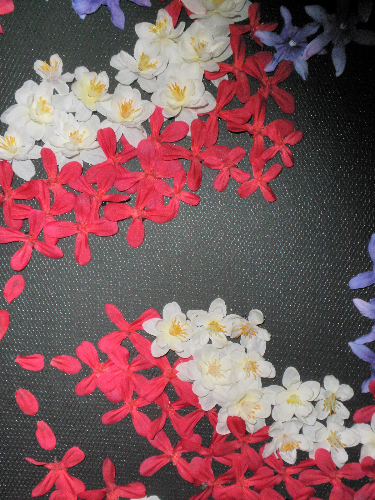
The assignment for 'The Grid Project' was to take a picture and recreate it using a pre-existing grid. All around us we can see grids, in the construction, calendars, and curtain patterns. For my interpretation, I  chose to go with the some sort of image in the style of art nouveau, as that has been influencing me recently. Below is the image of a stained glass window of which I chose to convey in my final piece.


You can see that it has a lot of curves and this was completely intentional. The biggest difficulty with pixelating something is figuring out how to make curved lines while conforming to a grid space and using straight objects. My grid space was green mesh netting on top of a black poster board which I then used as the canvas to apply different colored fake flowers as pixels. The netting was small, but the flowers are laid out in such a way that they still follow the rows and columns of a grid. Though a difficult process, trying to lay out pieces on the same plane (not to mention keeping the kitten away from it!), but that were next to each other, I think the end result is a fantastic piece and I will be using is as my own wall decor.


Grid Art Reviews

Lauren - Her beach scene created from beer bottle caps had lots of colors and plenty of variety. The different logos on the caps added texture to the scene, taking areas such as the sand and palm fronds to another level.

Kim - Using square rhinestones, she turned a photograph into a 3D object. The piece was amazing, varying blues in the skin tone to create shadows like a normal face would have. Because the objects were small, it allowed for better shapes. Before I knew the eyelashes were painted on, I thought this was the most incredible feat, making those contours. It would have been nice to see it done with the straight edges.

Catherine - Using one of the iconic symbols we talked about in class was a great idea. The construction of the face was very accurate, and the use of cursive really did something difficult.

Sabrina - I think your choice for a background material was really interesting! Although I've seen it in construction before, I never would have thought to use a peg board as a grid. Its especially interesting because the holes aren't necessarily what forms the grid; the spaces between them makes a large grid of squares too.

Michelle - Good idea for the image; KONY is such a hot topic right now and is completely relevant.

James - Like Santiago said, the grid is a little too tight in some areas, but I really liked that you chose an image that was almost all curves. This is personally what I strove to do, since making curves from square piece is difficult.

Juan - Unfortunately, this one also had issues staying within the lines of the grid. Star Wars, however, is such an iconic image that I really think this is something cool you could hang on a wall later.

Chris - The best part of your project was that, although it was essentially two dimensional, the use of colors allowed you to capture the dimension of the buildings, and this is AMAZING.

Arielle - Using Cheerios and M&Ms was a great idea because it transforms something that people have seen throughout their entire life and puts it into a context besides 'Let me put this in my mouth.'

Cody - OMG. David Bowie. Besides choosing an awesome image, I think you nailed the areas of color in this piece like the blue makeup. It would have been nice to see more color dimension, but we all know Post-Its only come in so many colors.

Maria - Your image was really well crafted, but I don't really think that using glitter glue qualifies as using grid objects. The specs in the glitter may be able to fit into a grid, but the way they are applied does not do this.

Nakota - Using a placemat was really innovative idea! It goes along with the idea that Santiago was trying to make us think about with this project, that there are grids everywhere.

Saturday, February 25, 2012

In Case You've Never Heard...

As the predecessor to television, radio programs have many commonalities in structure and content to TV programming, although the way program storyline is presented to the user. On OTR.com, all of the Internet audience is able to listen to a variety of radio programs from decades ago. After listening to Captain Midnight - The Perada Treasures, Episode 1, it is interesting to look at the program's characteristics that are still a part of popular entertainment.

Aside from the obvious variance in visuals, there are plenty of things that radio and television share characteristically. Without the visual presentation of the scene and setting, it is essential that the announcer set up the scene and give story background at the beginning, just like how television programs recap the previous episode at the beginning. Character stereotyping is something done in entertainment to help the audience immediately 'know' the character without having to say very much, but in radio, the stereotyping is even stronger. The Spanish character in this episode has a terrible accent, most likely not a person of hispanic origin at all, as there is no need anyway because the audience cannot see the speaker.

Advertisements are still prominent, except, in radio, the ads are done by the announcer and are at the beginning and end of the program, instead of throughout the program. A fifteen minute show, Captain Midnight ads feature one sponsor and a plug for the show's fan club. The ending ads do not introduce new commercials, but recap the same sponsor. Interesting enough though, programs has fan clubs and free incentives for fan viewers, just like we have today. Although now one can go online and register for these, the announcer tells the audience that to join the Captain Midnight club, all you have to do is go down to the local store to sign up on paper.

First Impressions of Earth

As a child of Generation Y, the Internet has been the technological consumer product that has played an integral part in my personal development. I may be partial in saying this, as I am going into a computer-based field, but this medium has exposed me to a world I would not have seen otherwise. Web sites like YouTube have made production more accessible to the American population and have enabled whole new genres to emerge. Its so hard to believe how far the Internet, and the computer, have progressed in their short lives. While this was my helper in cultural development, for generations before me, the television was the invention that changed how people got their information and entertainment.

After interviewing my grandmother, the 81-year-old Dawn Frojelin, I have come to connect the relationship I have with the Internet to the relationship she had with the television when she was young. TV was not something that everyone could originally afford. The first time she saw a broadcasted video  signal was, like many, in a department store. In 1947, all that was available for consumers were televisions with seven inch screens that displayed on black and white images, but she still "couldn't believe it; we expected it to be something on the wall that used a projector," just like the way the movies work. When her family for a TV for their own home, approximately one year later, the set only received one channel from the Chicago area, and the only programs available were about news and wrestling. The most famous early programs were produced in New York, too far away from the signal. Only on a trip to the big city was she finally able to see shows such as 'I Love Lucy,' which was one of the ones that was making up pop culture at the time. Color television was the next step in innovation, and in 1967 when the family got their first full color set, the Ed Sullivan Show and entertainment & situation comedies were now available to the American audience. "None like them today!" she exclaimed over the phone.

Wednesday, February 22, 2012

Flip-Book Project Comments

Chris - I liked how you used a silhouette of a man as your character; it made if feel real, but like a cartoon, fitting with this project. He seems to be eaten alive by the cloud and then end and I was wondering if this was one purpose.

Erin - My favorite part of your animation was the circles that go up the page, and the transformation to a bird and then a tree. Good use of the flip-book transformation idea.

Maria - I really liked the classic use of the stick figure motion, like when the character is on the skate ramp. It calls to mind the common form of flip-book animation which is the stick figure on post-it notes.

Brian - Good use of storyline. Love the colors of the music notes and the idea of them being dissolving objects that we can actually see.

Juan - Your piece did well in getting a message across to the viewer, although I am not sure what that message is meant to be. I like how there are only 3 colors; this also seems to help the message get across because the color was obviously thought out to emphasize certain elements.

Cody - Your animation was my favorite. The small figures make it seem like they are more integrated with the media, coming to life from the text on the page. The writing on the edge of the pages added something to the notion of using multiple pages and the sparing use of color really made things pop.

Sabrina - Liked how the bucket empties the water into the scene! Like Cody's, this seems to help it seem like the animation is more a part of the book, coming from the pages.

Kimberly - Liked yours, but I wish you had done more with the writing of the text! This was probably the most interesting part because it was text overlaid on the text of a book.

Arielle -  Your animation also used a text as an animation, which I really liked, but it was hard to tell what you were trying to write. The letters should have held for a few frames longer so that the transitions didn't happen so quickly.

Michelle - This is the perfect medium to have a person live in a fantasy land! Love the writing of your name at the end of it; makes it feel like you are more connected to the piece.

Lauren - I like your spray can character! Wish he had been brought back at the end. The graffiti characters were really well done and work great with the text on the book pages.

James - The flowy brush strokes were what really made this animation for me. Your scenes did seem to change rather quickly and I wish you had held onto one idea for longer.

Nakota - Your animation did something that no other animation did: perspective. The use of the landscapes really helped with the notion that the people were walking about on the plane, and that some people were on different planes.

On-Screen Debauchery Emerges

When talking pictures first began, many people didn’t believe that the medium would become such a big part of American culture. But, the technology progressed, cinema started to have narrative stories that played on people’s fantasies or their own realities, and Americans went to the movies by the hordes. The first color picture, The Wizard of Oz, told the story of the fantasyland that a young Midwestern girl dreamed of. It had elements of the unreal mixed with the actuality of the Dust Bowl and depression that Kansas’ residents were dealing with in 1939. Likewise, thirteen years later, Singing in the Rain let viewers into the more-relative fantasy of the movie production.

Then along came A Clockwork Orange, and Stanley Kubrick threw a reality all too real into the faces of his audiences. While he follows the fantasy-mixed-with-reality mold, the reality he shows is not the reality that your average moviegoer encounters on a regular basis, and it is most certainly not what he or she is used to seeing in cinema. Although a completely unplanned connection (watch McDowell explain the scene below), the infamous ‘Singing in the Rain’ scene calls upon the first musical film in such a way that would never have been imaginable even when the song was composed. As the Droogs invade the home of one English couple, they proceed to rip apart the home, although looking for nothing in particular. Alex and his goons proceed to rape the wife in front of her husband while both victims are bound, gagged, and beaten. Reality of this scene is that there are members of society that commit these crimes, but these occurrences are ones that are pushed to the backs of our minds, kept under wraps, and not openly displayed to the public. Controversy was maybe a part of Gone With the Wind, but even this controversy was written for film—it was published years before. Kubrick rode the success of his previous film, 2001: Space Odyssey, to break the boundaries of what moviegoers can handle visually. It is no exaggeration to say that he is the one who blazed the trail so that programs depicting gore and violence, such as CSI, can now be show to the American audience. He is the one who allowed for true reality to be shared with America.